Lyra Morgan

Contemporary Art

Water by the Thames

Exhibition news, PublicationsLyra MorganComment

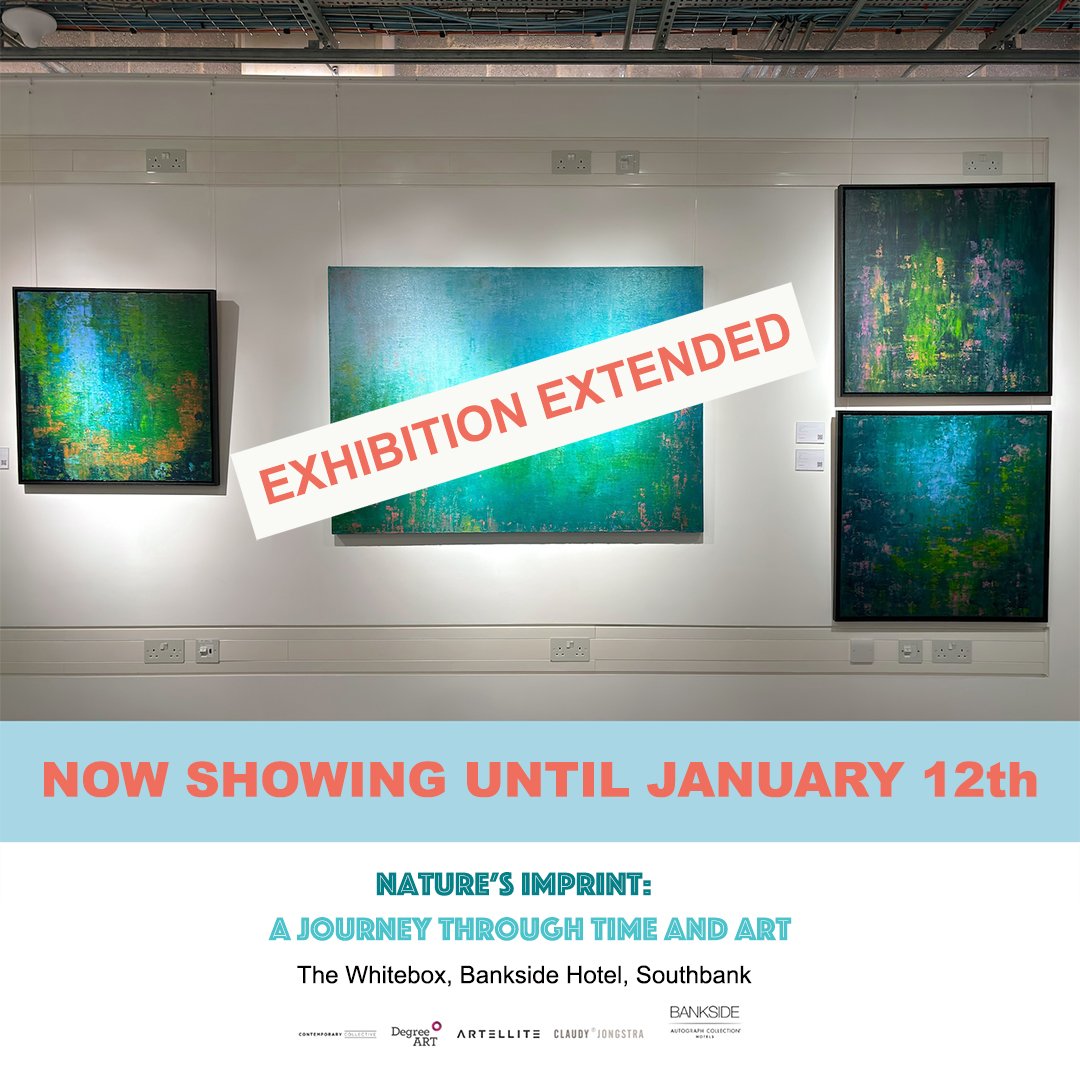
If you are near London's Southbank sometime between now and late October, take a break at the lovely Bankside Hotel and see the Nature's Imprint Exhibition. There are artworks by seven artists. Described by Fuse Magazine as "a must-see for anyone interested in the intersection of nature, sustainability, and artistic expression". It seems appropriate that my paintings of water are this close to the Thames.

Read the full article and other arts and culture news.

Nature's Imprint

Exhibition newsLyra MorganComment

“Nature’s Imprint: A Journey Through Time and Art”, I’m very happy to be part of this exhibition which runs from the 29th May - Late November, 2024 in The Bankside Hotel’s White Box Space on the Southbank, London.

The exhibition speaks to the profound and intricate relationship between nature, sustainability, and artistic expression. This collection of artworks invites viewers to reflect on their connection to the environment and the role of art in advocating for sustainable practices. Through their innovative approach, they thoughtfully explore the intersection between art, nature, and humanity.

For more info https://www.degreeart.com/natures-imprint-journey-through-time-and-art

Colour me in!

At workLyra MorganComment

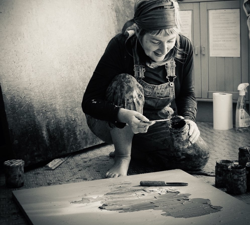
I decided to drain the colour from this pic of me in my studio, just as a lovely reminder of how amazing colour is! Can you imagine a world without it? I can't. ⁠ ⁠ So happy to be an artist who works with colour.

On Exhibition

Exhibition newsLyra MorganComment

Delighted that Beginnings has been selected for Grey Cube’s 2021 Exhibition and been given an honourable mention. To view the exhibition click here.

I love beginnings….every time I start a new piece, it feels like going on an adventure, it feels like the very start of something exciting. I love that I don’t know where the paint will take me and that there is this trust that whatever happens will be positive.

On the telly!

PublicationsLyra MorganComment

Forgot to mention this when it broadcast in mid May……

It was Sex, Myths and the Menopause on Channel 4 with Davina McCall⁠

Davina talks about her own experience in a bid to get women talking about theirs and discovers that help is out there.⁠⁠ Lovely to spot Davina walking past my paintings in the amazing clinic Newson Health!

Real Life Art Inspo

PublicationsLyra MorganComment
collectors bulletin copy 2.jpg

There is always a sense of connection with an artwork I have created so it is soooo lovely to see where a piece finds its new home .....⁠

To see that it has travelled and found its way to a space in which it seems it was meant to be , where it is 'at home' - that makes me smile and, in this case, it also brought a tear to my eye. ⁠

Many thanks to the collector for sharing. ⁠

Hope (green, top left) is also featured in @degreeart Collectors' Bulletin along with other pieces which have connected artists, creativity and collectors. ⁠

Cactus Cool!

PublicationsLyra MorganComment
cactus.jpg

Looking for inspiration for your very own salon style gallery wall?⁠
⁠How about luscious shapes and natural structures, bringing the outside in?⁠
⁠'Cactus Cool' has been curated by @degreeart.⁠
I'm loving the way this wall looks and delighted that my piece 'As One' is included in the collection (top right). ⁠
Check out DA's website for Cactus Cool, Urban Junkies, Safari Shuffles and more!

Finding an Equilibrium

Lyra MorganComment

Delighted that my experimental piece Equilibrium IV is part of an International online exhibition. Such a different way of working for me but actually just as fulfilling. Equilibrium is about the pursuit of finding balance in all things, that place where things come together as one and the whole is greater than the sum of the parts (just like a body of water).

To view the Art Room gallery exhibition

Resonating!

Exhibition newsLyra MorganComment
resonance II_for web.jpg

Resonance II has been given an honourable mention in the Grey Cube Gallery’s international online exhibition. With entries from all over the world, the exhibition is based on the theme of water - a theme I explore in almost all of my paintings. Resonance II is a large piece at 100 cm by 100cm. It is my representation (through colour and water) of deep and enduring love. A love which resonates beyond the surface. To view the exhibition, visit https://greycubegallery.com/current-show/index.html

In the Moment - on exhibition

Exhibition newsLyra MorganComment
in the moment_web.jpg

Delighted that In the Moment has been selected as part of the Light, Space, Time 10th Anniversary annual virtual open exhibition. The exhibition received entries from over 35 different countries. In the Moment is my recognition that water is an amazing teacher!   Water reminds me to embrace the transient nature of time by being very present in each moment.  To view the exhibition, visit https://www.lightspacetime.art/open-art-exhibition-2020-painting-other-media/

Yves Klein knew some things!

PonderingsLyra MorganComment
yves klein on our shared horizon web.jpeg

What Yves Klein says about colour really resonates with me . . .

“For me, each nuance of a color is in some way an individual, a being who is not only from the same race as the base color, but who definitely possesses a distinct character and personal soul.… Nuances can be gentle, evil, violent, majestic, vulgar, calm, etc. In sum, each nuance of each color is definitely a "presence," a living being, an active force which is born and dies after having lived a sort of drama of the life of colors. Color is sensibility in material form, matter in its primordial state."  Yves Klein

When I a paint, it does feel like the painting takes on a life of its own and once complete - the character and energy it exudes can change the way a space feels.  

I also appreciate Klein’s many thoughts about blue being special . . .

“Blue has no dimensions, it is beyond dimensions, whereas the other colours are not… …all colours arouse specific associative ideas, psychologically material or tangible, while blue suggests at most the sea and sky, and they, after all, are in actual, visible nature what is most abstract . . . we can never touch blue of sea or sky so it is as beguiling, it is the great beyond.  Just experience it and enjoy it and open your eyes to the great blue beyond”.

I am aware of blue being this ‘great beyond’ as it does feel infinite and as an artist that is so exciting; knowing that I will never tire of my journeys through and in paint!

Big news! I'm starting a painting in a colour other then blue!!

PonderingsLyra MorganComment
IMG_3102.JPG

It must be because Spring is in the air - as for the first time in a number of years, I am actually starting a painting in a colour other then blue! I suspect blue will make its way into the painting at some point though. Sometimes, I don’t work on a theme like water. Sometimes it is all about the colour. Can’t imagine a world without colour, I wonder how much we take it for granted? Today I am celebrating colour - one of life’s pleasures is to take a blank canvas and create a splash!

Why Blue?

PonderingsLyra MorganComment
a celebration of blue v2 SM.jpg

Why do I  use blue?  Perhaps it can be explained by psychologists or the late artist Yves Klein, I don’t know. I do know though that I am drawn to it, almost magnetised by it. It feels infinite and open, peaceful, tranquil.  It reminds me of a particular time when I was scuba diving; we were all looking at the coral wall and the wonderful sea life living on it but something told me to turn around….to look into ‘the blue’ - there was nothing but blue but then…..a second later ….a Manta Ray ‘flew’ in from the blue, her grace and beauty made me cry!  

Of all the colors, blue is the most liked by both men and women. It is no surprise then, that many artists—Louise Bourgeois, Yves Klein, and Wassily Kandinsky among them—have expressed a preference for it. According to psychologists, the popularity of the hue may take root in our evolutionary development. In the hunting-and-gathering days, those drawn to positive things—like, say, clear skies and clean water—were more likely to survive, and, over time, this preference for the color blue may have become hard-wired.

Yet, scientifically speaking, the sky and the oceans aren’t really blue—or at least not in the same way the soil is brown or leaves are green. This posed a big problem for most of art history. You can’t take the blue of the sky, grind it up with a mortar and pestle, then throw it on a canvas. Unlike certain reds, browns, and yellows, blue pigment isn’t quite as easily made.